My email door is always open. If you want to follow my recent work check out my instagram.
Come say hi →
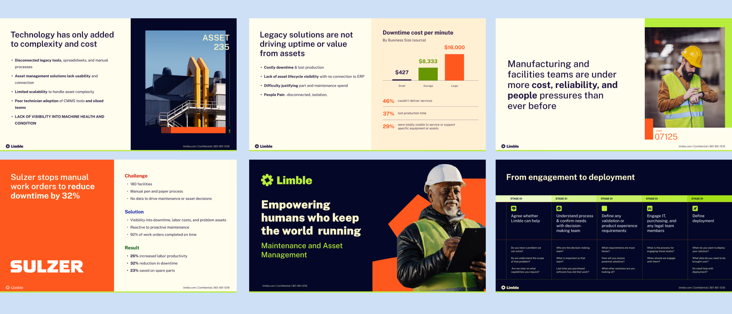
Limble is a cloud-based platform that helps organizations streamline maintenance by centralizing work orders, asset tracking, preventive maintenance, and inventory management. It enables teams to reduce downtime and improve productivity by automating workflows and providing real-time insights.
See live site →

Limble’s brand had become outdated, with inconsistent colors and a website that had outgrown its WordPress foundation. The challenge was to modernize the brand and create a more scalable digital experience.
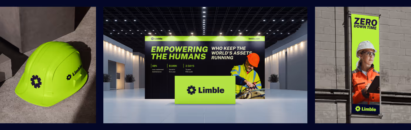
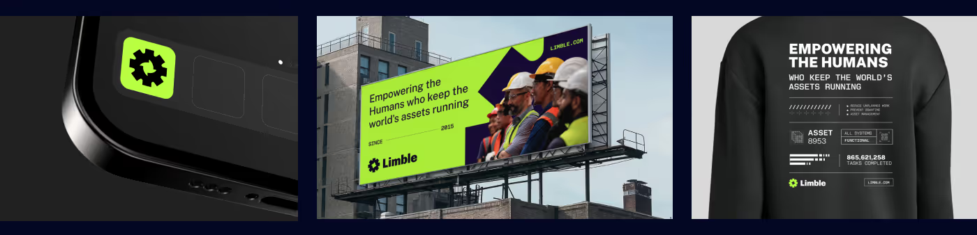
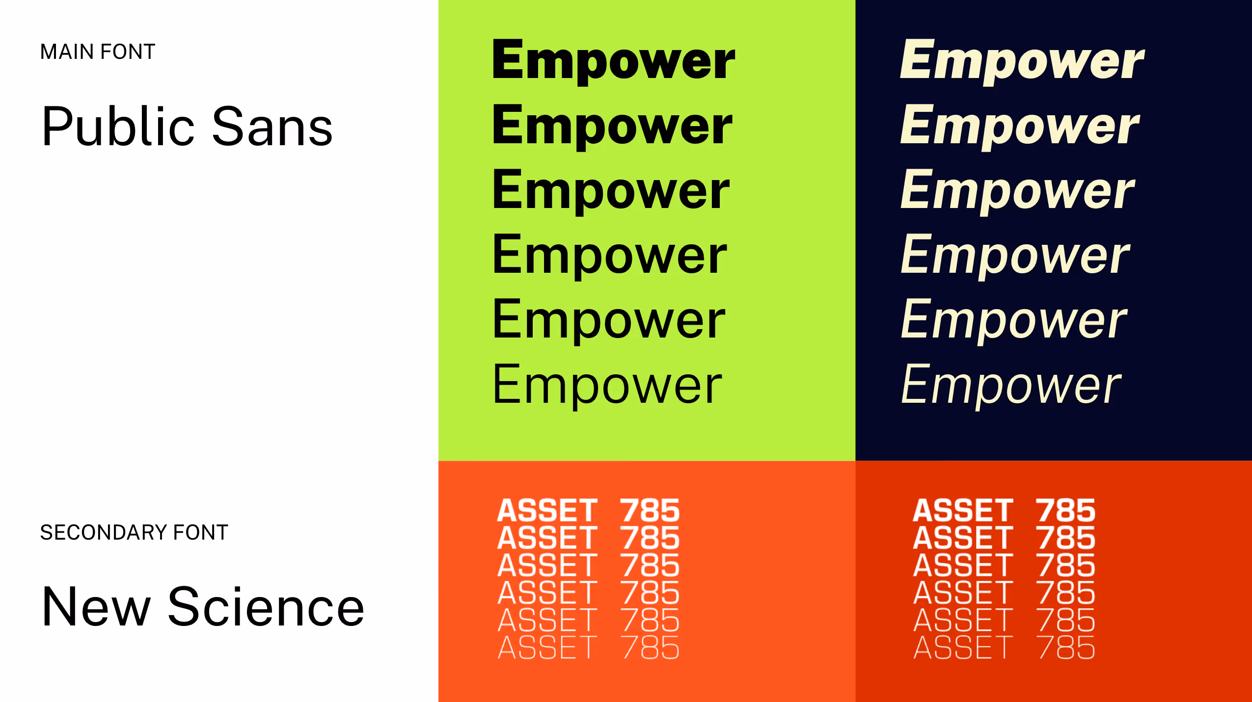
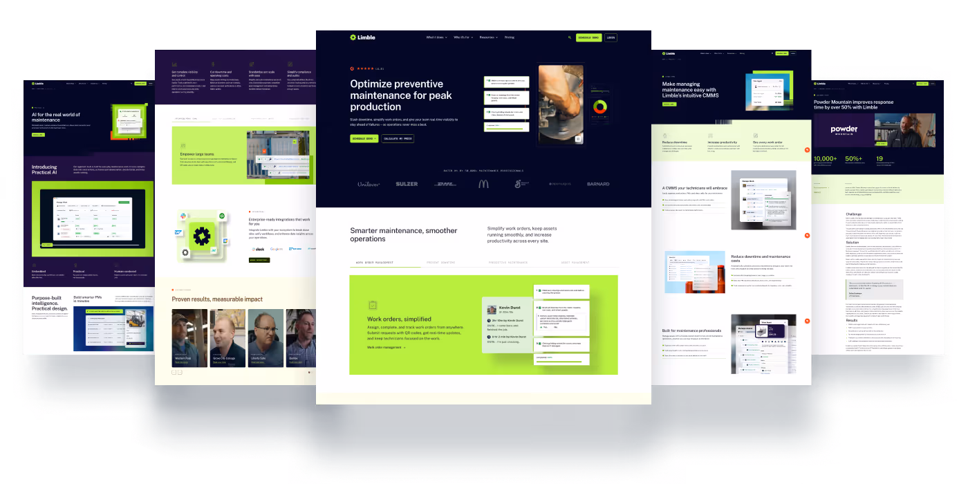
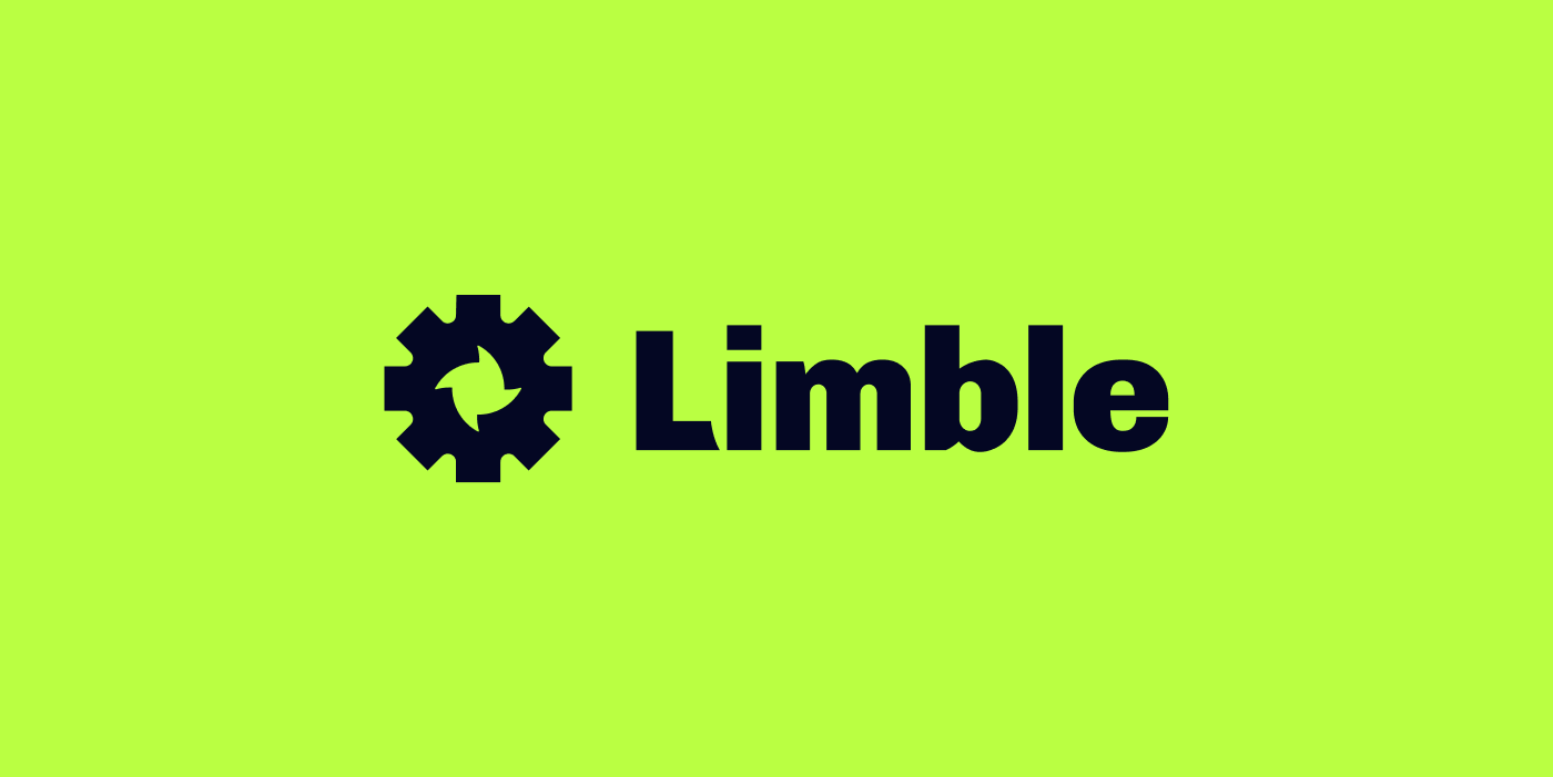
We evolved the logo and refined the color system to better reflect Limble’s bold, confident identity, while migrating the website to Webflow to support greater flexibility, performance, and scalability.
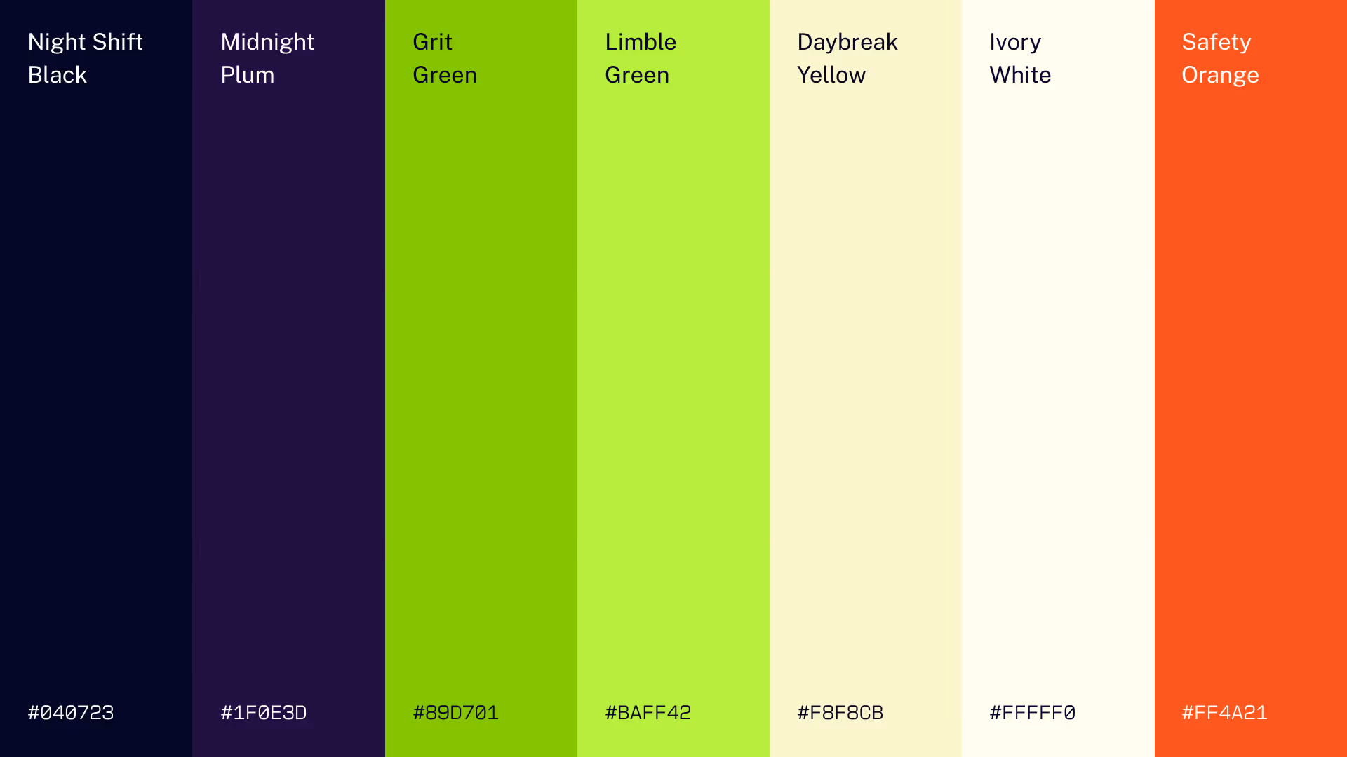
Limble’s previous brand lacked scalability and visual cohesion. Its use of safety-oriented colors also created unintended associations—like red signaling danger rather than energy—since these hues carry standardized, urgent meanings that can subconsciously shape how the brand is perceived.

The result is a bold, distinctive brand with refined colors that stand out, powered by a scalable system designed for enterprise growth.


Design with clarity, not complexity. We create space for the message to breathe, guiding focus with intention and restraint.
We design to grab attention and leave an impression — through bold composition, confident color, and meaningful storytelling.
Refined, timeless, and confident. Our design choices reflect experience and trust — thoughtful details, balanced tone, and consistency that builds credibility.

The new Limble logo is a refined evolution of the original—retaining its recognizable gear foundation while removing the visual noise and fragmentation that made the old mark feel busy and less intentional.
By simplifying the form into a more cohesive, balanced shape, the new logo better reflects reliability, precision, and uptime—core to what maintenance teams deliver every day. It also feels more modern and mature, aligning with Limble’s growth into a more enterprise-ready platform. The result is a clearer, more confident mark that not only scales better across applications but more accurately represents the strength and stability our customers expect.


The Limble design system is intentionally bold and requires a strong understanding of grid, hierarchy, and color balance to execute well. When used thoughtfully, the combination of Limble green, black, and structured layouts creates a confident, high-impact visual language. However, if applied without discipline, it can quickly feel cluttered or amateur. Success comes from restraint—using the right amount of green to guide attention, maintaining strong alignment to the grid, and organizing content with clarity and intention. This balance is what elevates the system from visually loud to distinctly premium and professional.


The icon style draws inspiration from classic digital dot matrix consoles, bringing a subtle nod to industrial interfaces and legacy systems. Each icon is carefully handcrafted with pixel-level precision, ensuring consistency, clarity, and a distinct visual character that feels both technical and intentional.
The previous WordPress site had grown to over a thousand pages across multiple ownership cycles, resulting in inconsistent structures, fragmented CSS, and a sitemap that was heavily manipulated for SEO but ultimately became inefficient. We rebuilt the entire experience from the ground up in Webflow, applying best practices, streamlining the architecture, and significantly improving the UI/UX. It was a massive undertaking—successfully completed in just nine weeks.
See live site →
